The eLML content elements
Read the concept and structure page in the "about" chapter to understand the eLML structure and the pedagogical concept behind this structure. Please also read the eLML CSS manual because most of both the structural and content elements can be adapted using CSS. For more information about attributes go to the next page. The following and last page of this chapter will explain what top level elements (lesson, unit, learningObject, glossary, bibliography etc.) are and what they offer.
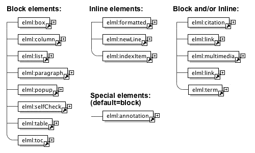 The available eLML content elements listed according to their display possibilities
The 'annotation' element (special - default=block)
The 'annotation' element (special - default=block)
The "annotation" element is meant for containing additional information like links, images, more text etc. about a certain topic. It is a special element because its representation has to be defined by a project or else you won't see any difference to a normal paragraph. This means, by default, the content of an annotation element will be displayed as a normal paragraph as you can see below. You have to create a special (e.g. two column) layout and define that one column contains the content and the second column contains all the annotations to really be able to use the potential of this element. As you can see in the following example, the annotation element is transformed as an DIV tag in HTML with the CSS class called "annotation". Check out the source view of the following paragraph:
To see one implementation of the annoation element just hoover over the above button and you should see the annotation in a seperate floating window on your left (check out the UZH layout version to see this effect in another layout). A second possibility especially when using YAML would be to include the annotation content within a separate third column.
You can include any content you like into the annotation: text, tables, lists, images, movies etc.
The 'box' element (block only)
The 'box' element (block only)
This box-title is always within the box
The <box>. element is presented using a DIV tag. The exact layout is defined in the CSS file. Please note that boxes can have titles and icons (like the remark icon used in this example). A box can contain nearly all content elements, with the exception of the "column" element that can only be used on the "top" level of the content elements (right after a structural element like "clarify", "entry" etc.).Of course you don't need to use all this fancy stuff (note the XML representation below):
<box>This is a simple box.</box>
The 'citation' element (block and inline)
The 'citation' element (block and inline)
This part describes the different uses of the element <citation>. Please note that this element is one of the eLML elements than can be used as either block, if used as sibling of other block elements, or inline representation, if used nested within another content element! Using the "yearOnly" attribute you can make sure that only the year (and page number) are printed out and the name of the author is not (see example 2 and 4). In this case you will have to write the authors name yourself within the text (if you want it to appear). Here is what the citation element looks like (in example 3 and 4 it would of course be empty and contain no text):
<citation bibIDRef="webist2006" pageNr="15">XML is easy to learn.</citation>
Citation used inline
- The most common use is to include and reference a direct quote. In this case the citation element contains the cited text and the page number where the quote appears should be added using the "pageNr" attribute (optional):
... it is stated thatXML is easy to learn
(Fisler et al. 2006, p. 15). This means that ... - If you want to cite a direct quote but state the name of the author leading to the citation, then you must use the "yearOnly" attribute and write out the authors name in the text:
In their book Fisler et al. state thatXML is easy to learn
(2006, p. 15). Therefore, ... - The citation element might also be used to paraphrase a work and reference the literary source. In the example the citation element contains no text and is an empty element:
… often it is written that XML would be easy to learn (Fisler et al. 2006, p. 15). Therefore, ... - Sometimes you may want to state the name of the author in the text leading to the citation and have just the publication year in brackets. To do this use an empty citation element included the attribute "yearOnly" set to "yes" and make sure that your write the authors name because eLML will print out only the year:
In their book Fisler et al. (2006, p. 15) state that XML would be easy to learn. Therefore, ...
Citation used as block
5. If a quote is longer than a couple of words, we may wish to display it as separate paragraph:
"XML is easy to learn." (Fisler et al. 2006, p. 15)
6. Citation as empty block element: This case is currently not displayed in eLML because it doesn't make sense. When using citation as a block element you should always include a quoted text.
Please note: If using the citation element as a block it can contain the attribute icon set to remark, question or important etc. If the representation attribute is set to inline the icon attribute is ignored. Like almost all elements, <citation> can contain the attribute "label" which allows to label it and to link to it from any place within the lesson.
Citation: HTML code Remarks
In older versions of eLML the citation element was displayed mostly in italic font using the <i> tag. With eLML 6 and the possibility to create more elaborate XHTML 1.1 Strict HTML code, the citation element is transformed into the HTML tags <cite>, <blockquote> and <q>, depending on the representation mode. See the XHTML 1.1 chapter for more information.
The 'column' element (block only)
The 'column' element (block only)
The <column> element can either be used on the "top" level of the content elements (right after a structural element like "clarify", "entry" etc.) or within a box or popup element. You have the possibility to use a two- or three-column layout to better display your content. Within a column you can use all of the content elements with the exception of the column element itself. You also have the possibility to horizontally and vertically align the content of your columns. You can see an example of a column below (where the "list" element is presented) or on the elml.org entry page: The news flashes are in one column, the boxes on the right are in a second column. For examples of the align/valign attributes scroll to the end of this page.
The 'formatted', the 'indexItem' and the 'newLine' element (inline only)
The 'formatted', the 'indexItem' and the 'newLine' element (inline only)
The <formatted>, <indexItem> and the <newLine> elements can only be used "inline". That means, they can only be used within paragraphs, boxes etc. The element has only two attributes, one is the "cssClass" attribute to apply unique CSS classes and the other one is the "style" attribute, whose values are listed in the table below:
| Tags allowed within simple text | |
|---|---|
| <formatted> |
formatted 'bold'
formatted 'italic' formatted 'lower Case' formatted 'underlined' formatted 'upper Case' formatted 'code'
formatted 'subscript' formatted 'superscript' Formatted elements can also be nested. For example: This text is bold and subscript. |
| <newLine> | <newLine> creates a line break. The attribute 'space' controls the size of the spacing to the next paragraph (values: short, long). |
| <indexItem> | The <indexItem> element is used to mark special terms that should be listed in the index at the end of the lesson. To create an index you must enter an empty <index> element between the <bibliography> and the <metadata> element of your lesson. An indexItem is usually displayed in italic but its representation can be defined in the CSS file. |
The 'link' element (block and inline)
The 'link' element (block and inline)
Another special type of element is the <link> element. It can also be used inline (nested) or as a paragraph. Please note that a "download link table" will be created if you have more than one link used as a block element right next to each other (siblings). Using it and its attributes appropriately gives several possibilities to link within the lesson or to external resources:
- External link (inline): To link to another website using an URL you should use the
uriattribute. Use thetargetattribute if you are using frames (read here if you want predefined values for the target-attribute). - External link (as paragraph): As above but instead of using the link element within e.g. a paragraph you use it as a sibling of the paragraph element.
- Internal link within lesson: Use the
targetLabelattribute to e.g. link to the Firedocs eLML Editor chapter. Note that the their needs to be a matchinglabelattribute somewhere in the lesson, else the lesson will not be valid. Firedocs will present a pulldown menu of all possible values. - Link to another lesson: Use the
targetLessonattribute combined with thetargetLessonLangattribute (fix values are de, en, fr and it) if the lesson is written in a different language. This will link to the entry page of the lesson. - Link to a specific chapter within another lesson: First link to the other lesson as described above and then use the
targetLabelattribute to another label. This works only if the label is a unit, learningObject, selfAssessment or summary in the other lesson. Please note that this will generate an invalid lesson since the label was not found within the original lesson. You'll have to live with that :-) - Download resource (inline): Use the
uriattribute with relative paths to point to the file. You can also add more attribute likesize,typeorlegend. Example: this nice paper - Download table with many resource: Use many link elements one after another as block/paragraph elements and you'll get a download/link table like this:
| Download demo movie | 1GB | MPG | a short moview | |
| eLML Website | Click on this link | |||
| Weird sword sound | mp3 | might take a while to download this | ||
| How to hack eLML? | 3 MB | you need the acrobat viewer to view this | ||
If a link is presented as block the attribute icon can be used to set one of the defined icons (important, remark or question).
Download PDF version of eLML website [5.5 MB - might take a while to download this - Filetype: PDF]
Using the role attribute you can define if a certain link is only visible for tutors or also for students.
The 'list' element (block only)
The 'list' element (block only)
Below a two-column layout using the <column> element and in each column there is an example of the <list> element. The "listStyle" attribute is used to define if you want an ordered or unordered list:
- an item
- another item
- yet another item
- first item
- second item
- third item
Two examples of a list with a title. The first list has nested another list in it, the second example uses the icon attribute and a bibliographical reference:
Title of this list
- some text
- another list
- also text
- an image could also be used
- some text
The 'multimedia' element (block and inline)
The 'multimedia' element (block and inline)
The <multimedia> element is used for everything that is not text. The <multimedia> element can be used inline (e.g. within a paragraph) or as a block (e.g. next to a list, table or paragraph element). It is important to understand the difference: If an image is used inline and aligned left (default) or right, the text is floating around the image. If an image is used as block element, the space left and/or right of the image is left empty. See the examples below and the extensive examples at the end of this page for more information about alignment. The second important thing to know is that these definitions are set within the CSS file. If you don't add the definition for the ".multimedia_*" classes in your elml.css file, there is no floating at all (see the CSS chapter). On the other hand: If you don't use a customized layout but work with the plain layout of the elml.xsl file, the most basic CSS class definitions are added automatically.
Here is an overview of the items a multimedia element can contain:
In the online version eLML will transform most of the multimedia elements (except images) using the <object> tag plus the deprecated <embed> tag. If you dont want eLML to create the oldschool <embed> tag, you can deactivate that in the configuration file!
- Picture (GIF, JPG, PNG)
- Flash
- Quicktime Video
- MPEG Video
- MP3
- RealOne (Audio/Video)
- SVG
- Java Applet
- VRML
- X3D
- MathML
- HTML or PHP
- etc.
This list will grow as needs grow. Here are some examples of multimedia elements and their XML representation:
 Test image with legend and bib-ref (Bleisch et al. 2005)
<multimedia src="../image/test.jpg" type="jpeg" align="right" width="200" units="pixels" legend="Test image with legend and bib-ref" bibIDRef="delfi2005">
The element multimedia also allows to set the attribute icon or to have thumbnails. In this case a small image (url defined in the attribute thumbnail) is shown in the lesson and the original image opens in a new window when clicking on the small image. This is especially useful for bigger flash animations. eLML also features a special "zoom-script" called "lightwindow"! Look at the following example and read the tutorial if you want to use this script.
<multimedia src="../multimedia/testAnimation.swf" type="flash" align="center" width="200" units="pixels" thumbnail="../multimedia/testAnimation.gif" legend="Test animation with legend and thumbnail">
An interaction included in the lesson (without thumbnail) could look like this.
<multimedia src="../multimedia/testInteraction.swf" type="flash" align="left" bibIDRef="webist2006" height="200" width="300" units="pixels" legend="Test animation with legend and bibliography reference">
You should always use the "width" and "height" attributes with movies or interactions. Some browser do have problem showing a movie in the correct size if the width and height are missing! You can see an example in the code above. Use "pixels" as unit since the "percent" option can also cause problems with movies.
A short MP3-Soundfile
MPEG Video of a rain radar
Including SVG or MathML in your lesson
Both MathML and SVGSVG XML languages that most modern browser can display directly without the need for a plugin (Please note that Safari does not display MathML directly...). If you want to use MathML or SVG in a eLML lesson you can either reference a file or directly write code in your lesson.
Example 1: Referencing an external SVG (or MathML) file. Please note that any content within the multimedia element is ignored if the "src" attribute is used:
<multimedia src="http://www.croczilla.com/bits_and_pieces/svg/samples/polygons2/polygons2.xml" type="svg" />
Example 2: Including SVG (or MathML) XML code directly into your lesson file. Please note that you must declare the SVG namespace correctly!
<multimedia type="svg">
<svg xmlns="http://www.w3.org/2000/svg" height="300">
<g transform="scale(0.8) translate(-200)">
<polygon fill="blue" points="350,75 379,161 469,161 397,215 423,301 350,250 277,301 303,215 231,161 321,161"/>
<polygon fill="red" points="850,75 958,137.5 958,262.5 850,325 742,262.6 742,137.5"/>
</g>
</svg>
</multimedia>
If SVG or MathML are used then the file ending must be .xhtml and not .html! eLML will automatically use the correct file ending if it detects either SVG or MathML in a lesson. Both SVG and MathML can also be used when generating a PDF using XSL-FO. Refer to the chapter Create a PDF version of your lesson using XSL-FO for more information.
The 'paragraph' element (block only)
The 'paragraph' element (block only)
The <paragraph> element is used to write normal paragraphs. It offers a lot of attributes to e.g. make it visible to tutors only, to be used only in the print (PDF) or online (HTML) version, to define a cssClass, a title or an icon.
A title of a paragraph
This paragraph uses both the "title" and the "icon" attribute. You can enter text in a paragraph but you can also enter the following elements: citation, formatted, indexItem, link, multimedia, newLine or term.
The 'popup' element (block only)
The 'popup' element (block only)
A <popup> element allows an author to write a question and to hide the answer. The student then has to click on the question to see the answer. The answer can include multimedia elements, tables etc.
How long would it take to hike to Ulan Baator?
I have no idea but this gives you an impression on how the <popup> element works. The display is defined in the elml.css file and is usually pretty similar to the <box> element. But it can be displayed totally differently. In the print version of a lesson the solution is always visible, since there is no possibility to "click" on a printed document.
By the way: The script that triggers the opening and closing of the box is stored in the elml.js file that should be included in a layout template.
The 'selfCheck' element (block only)
The 'selfCheck' element (block only)
The <selfCheck> element gives authors the possibility to add selfCheck questions (control questions) along with their content. This enables eLML authors to quickly add questions to their content without prior knowledge of Flash or JavaScript. eLML selfCheck questions don't support any LMSLMS functionality and therefore can't save the test results of students.
The following three types of questions are supported by eLML:
- single choice (one correct answer)
- multiple choice (more than one correct answer)
- fill-in-the-blanks (text with missing words that have to be completed)
The selfCheck element gives you some additional features:
- shuffle: single choice and multiple choice questions support the shuffle attribute which shuffles the answers on page reload.
- feedback: single choice and multiple choice questions support the feedback attribute which can be added to every answer. The feedback will be shown as a tooltip on the right hand side of the answer after the user tried to answer the question.
- solution: all question types support the solution element which can be used to give solution tips or sample solutions. The solution will be shown if the user gives the correct answer or clicks the "Solution" button.
- synonyms: the fill-in-the-blanks question type supports adding of synonyms for any specific gap to extend the possible correct answers.
- images: all question types support the use of the <multimedia> element to include images and other multimedia content in your questions and answers.
- custom CSS: all question types can be customized with CSS.
Introduction
Question 1 (single choice)
Question 2 (multiple choice)
Question 3 (fill-in-the-blanks)
By reading the question, you should be able to guess the answer.
The 'table' element (block only)
The 'table' element (block only)
You can see an example of a <table> element above where the "formatted" and other inline elements are presented. The table below presents the possible attributes of the "table" element:
Example of a title for a 100% width table
| Attribute: | Used for: |
|---|---|
| title | Inserts a title above the table |
| icon | Can be used for displaying an icon in front of the table. |
| width, height, units | Define the width and height of the table in pixels or percents. |
| bibIDRef | If a table is taken from a book etc. enter the bibliographic reference here. |
| align/valign | Used to horizontally and vertically align the content of a table cell. Have a look at the examples at the end of this page. |
| cssClass | All tables have the "table" CSS class assigned to them. With this attribute you can assign your own CSS class to a table. |
| legend | Enter a legend for the table. The bibliography reference is also part of the legend, if the attribute is filled out. |
| role | Create tables only visible for tutors using this attribute. |
| visible | Create tables only visible in the print or in the online version of a lesson using this attribute. |
Each table contains "tablerow" elements which themselves contain "tableheading" and "tabledata" element for each table cell (the former is used for the heading of a table and is displayed in bold). Each tableheading and tabledata element also offer most of the above elements plus the "rowspan" and "colspan" attributes for spanning over rows and columns.
The 'term' element (block and inline)
The 'term' element (block and inline)
The <term> element is used to reference glossary terms. If you want to talk about Cascading Style SheetsCascading Style Sheets or about XSLTXSLT and you entered the definition of this term in the <glossary> element/part of the lesson, you can reference it within a text. The definition of the term is then displayed as a mouseover element. Per default the mouseover contains only text and HTML-code, images, movies etc. are only displayed in the glossary itself. If you want to have HTML-code, images etc. also in the mouseover, set the variable $glossaryMousoverWithHTML in the configuration file to "yes". The script eLML uses for this effect is Walter Zorns Tooltip JavaScript. This script is highly customizable (color, font, size, behaviour etc.). Read the detailed instructions for more information.
If you want to have a glossary <term> included in a lesson not only as a reference to the glossary but as paragraph in itself you can use the element <term> as a block element and the term and its definition is directly included within the lesson. An example:
- eLML:
- eLML, the eLesson Markup Language, is an XML framework developed by the GITTA project. The Swiss eLearning project GITTA started working with XML in 2001 but it was only after the official ending of the project in 2004 that its XML structure was released as an open source project under the name of eLML. For more information read the implementation chapter or visit www.eLML.org. (Fisler et al. 2005)
The table of content 'toc' element (block only)
The table of content 'toc' element (block only)
The <toc> element is used on every page of this documentation at the beginning to show a table of contents of the actual page. The <toc> elements offers two attributes:
- scope: Defines the scope of the inserted table of content. Can either be "lessons" (only if a course with multiple lessons is transformed), "lesson", "unit" or "learningObject". In the latter case the titles of each clarify, look or act element within the actual learningObject are shown, a level of depth that the normal eLML navigation does not offer! This option was used within this documentation.
- recurse: If set to "yes", the table of content will be shown with two levels of depth (e.g. lessons and units or units and learningObjects etc.). Default is "no" meaning that only the actual scope selected is shown.
All about alignment
All about alignment
multimedia element: inline representation with align=left (default)
 This is the test legend
text text text text text text text text text text text text text text text text text text text text text text text text text text text text text text text text text text text text text text text text text text text text text text text text text text text text text text text text text text text text text text text text text text text text text text text text text text text text text text text text text text text text text text text text text text text text text text text text text text text text text text text text text text text text text text text text text text text text text text text text text text text text text text text text text text text text text text text text text text text text text text text text text text text text text text text text text text text text text text text
multimedia element: inline representation with align=center
 This is the test legend
text text text text text text text text text text text text text text text text text text text text text text text text text text text text text text text text text text text text text text text text text text text text text text text text text text text text text text text text text text text text text text text text text text text text text text text text text text text text text text text text text text text text text text text text text text text text text text text text text text text text text text text text text text text text text text text text text text text text text text text text text text text text text text text text text text text text text text text text text text text text text text text text text text text text text text text text text text text text text text text
As you can see, it is not possible in HTML to float around both sides!
multimedia element: inline representation with align=right
 This is the test legend
text text text text text text text text text text text text text text text text text text text text text text text text text text text text text text text text text text text text text text text text text text text text text text text text text text text text text text text text text text text text text text text text text text text text text text text text text text text text text text text text text text text text text text text text text text text text text text text text text text text text text text text text text text text text text text text text text text text text text text text text text text text text text text text text text text text text text text text text text text text text text text text text text text text text text text text text text text text text text text text
Now let's have a look at the exact same code with the only difference that the multimedia elements are not nested within the paragraph but outside of it and therefore displayed as paragraph:
multimedia element: block representation with align=left (default)
text text text text text text text text text text text text text text text text text text text text text text text text text text text text text text text text text text text text text text text text text text text text text text text text text text text text text text text text text text text text text text text text text text text text text text text text text text text text text text text text text text text text text text text text text text text text text text text text text text text text text text text text text text text text text text text text text text text text text text text text text text text text text text text text text text text text text text text text text text text text text text text text text text text text text text text text text text text text text text text
 This is the test legend
multimedia element: block representation with align=center
text text text text text text text text text text text text text text text text text text text text text text text text text text text text text text text text text text text text text text text text text text text text text text text text text text text text text text text text text text text text text text text text text text text text text text text text text text text text text text text text text text text text text text text text text text text text text text text text text text text text text text text text text text text text text text text text text text text text text text text text text text text text text text text text text text text text text text text text text text text text text text text text text text text text text text text text text text text text text text text
 This is the test legend
multimedia element: block representation with align=right
text text text text text text text text text text text text text text text text text text text text text text text text text text text text text text text text text text text text text text text text text text text text text text text text text text text text text text text text text text text text text text text text text text text text text text text text text text text text text text text text text text text text text text text text text text text text text text text text text text text text text text text text text text text text text text text text text text text text text text text text text text text text text text text text text text text text text text text text text text text text text text text text text text text text text text text text text text text text text text text
 This is the test legend
table/column element and their align/valign attribute values
| text example | image example |
|---|---|
 Test with align=left
|
text text text text |
 Test with align=center
|
text text text text |
 Test with align=right
|
text text text text |
 Test with valign=top
|
text text text text |
 Test with valign=middle
|
text text text text |
 Test with valign=bottom
|
text text text text |
